Graphic Design Toronto by DTW Graphic Designers
DTW is a Toronto-based graphic design team, providing our clients with the highest-quality design for strategic communications and brand building to enhance your business. Our experienced team has the expertise and experience to create logos, business cards, stationery, brochures, and flyers. Graphic design Toronto services include design tickets, invitations, presentation folders, catalogs, book covers, CD cases, posters, electronic greeting cards, PowerPoint templates, registration forms, and more.
Graphic Designers vs. Web Designers
A web designer needs to be a skilled graphic designer with specific training in web design, while a graphic designer is not necessarily trained in web graphic design. At DTW, many of our web designers previously worked for graphic design or printing companies before joining us and have since been trained specifically for web design. We utilize their experience of graphic design to provide your company with premier and cutting-edge design.

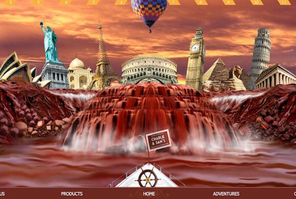
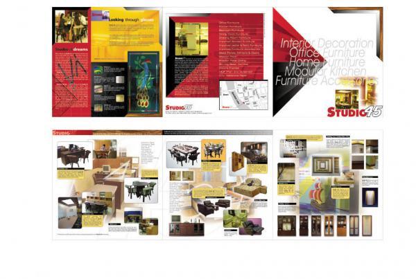
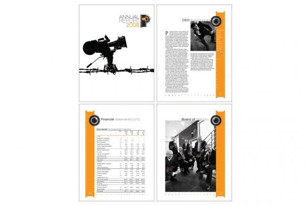
Here are some of our Graphic Design Toronto samples:
Design Balance
One of the most important principles or design rules that graphic designers follow is balance. Balance is what gives a design stability and equilibrium. It distributes visual weight throughout the design space, making the design seem fluid, rather than lopsided or heavy.
Rhythm & Unity
Using design principals of rhythm and unity to bring the design together, our graphic designers are able to provide products that relay a feeling of wholeness and oneness. Visually, these principals serve to unite the design as a whole and provide an organizational structure to your critical information.
Proportion
To maximize the relationship between design elements, scale (how large it is) and proportion (how large it is in relation to other objects) are typically used. Both scaling an object and keeping it in proportion to other objects ensure that the design is eye-catching and well-balanced.
Design Emphasis
Emphasis in design naturally draws the attention to the most important part. To achieve object emphasis, an object’s scale and proportion are used to draw your attention to the main focal point. Variety in design is used to draw the eye from focal point to focal point, allowing for the consumer to receive maximum content.
Shapes & Sizes
Shapes, like a heart or a star, can convey universal meaning while also helping organize the design at the same time. Mass, an object’s size and proportion, determine an object’s emphasis on the page. By creating both areas of emphasis and and opposing balances (often in the form of white space), a graphic designer can achieve a balanced, clean graphic design Toronto.


Recent Comments